OOH – SOCIALS – TRADE – PRINT
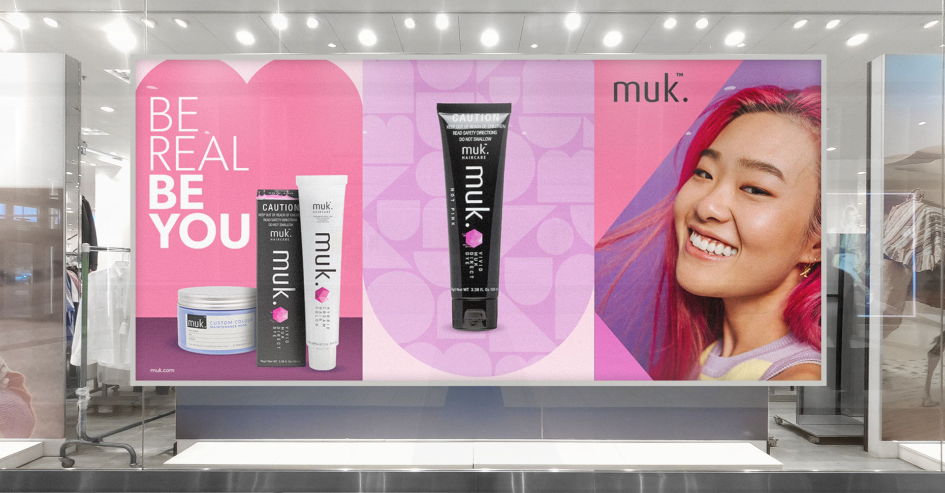
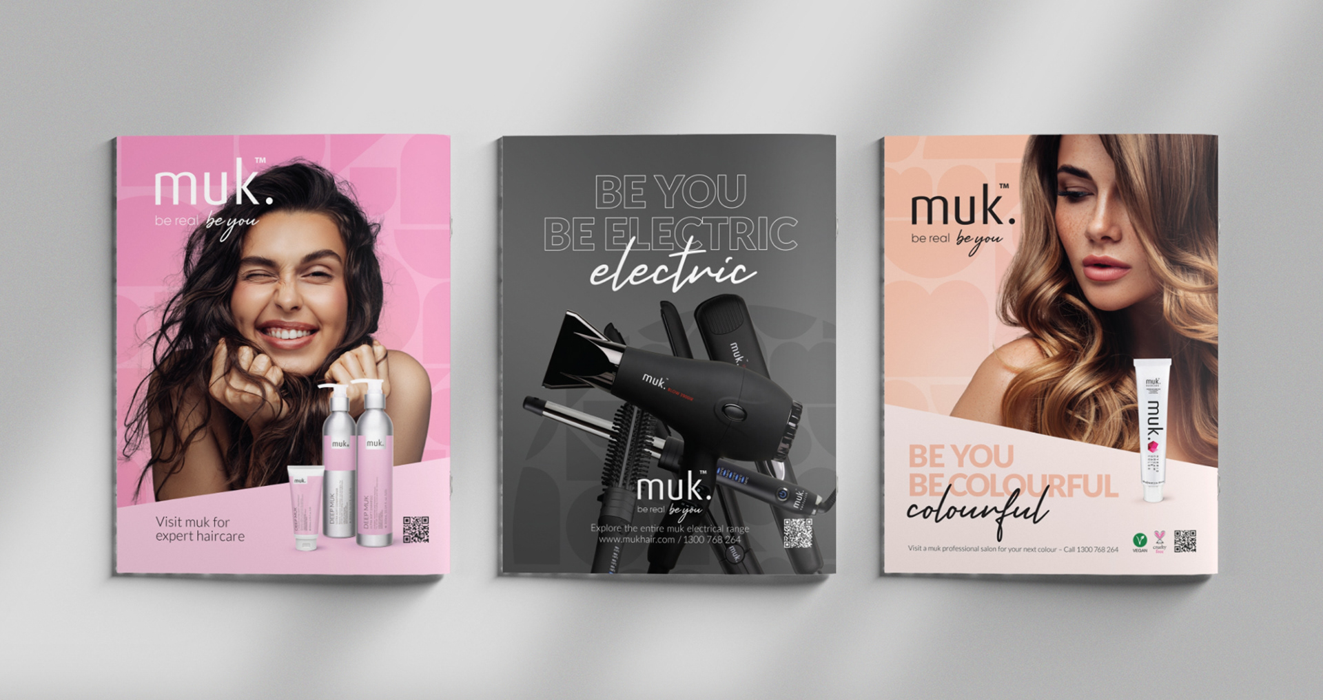
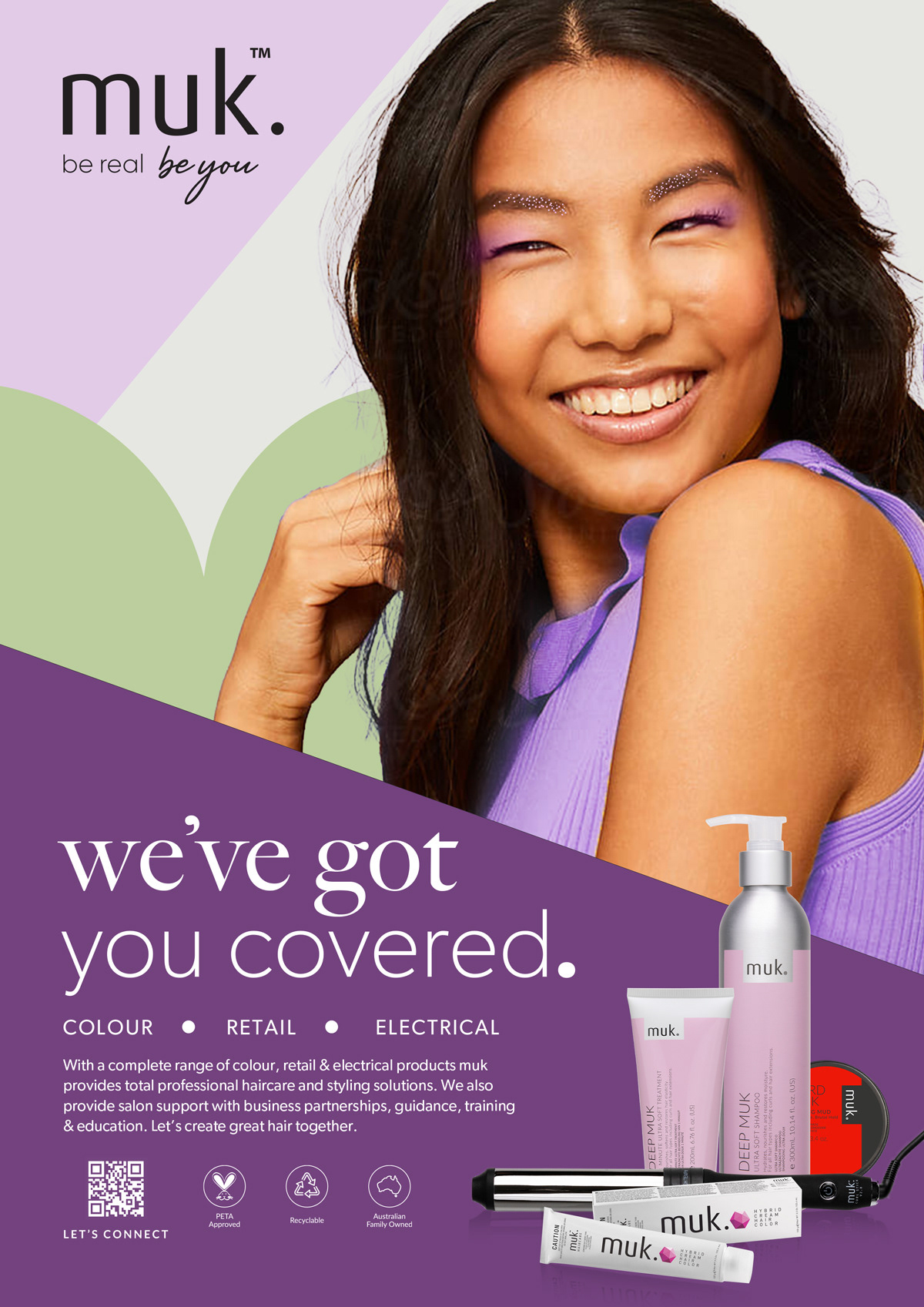
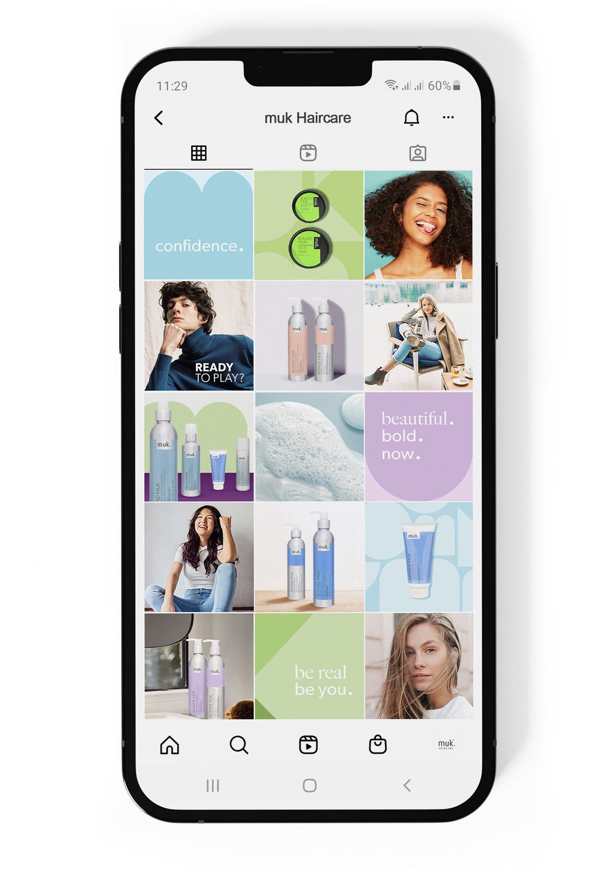
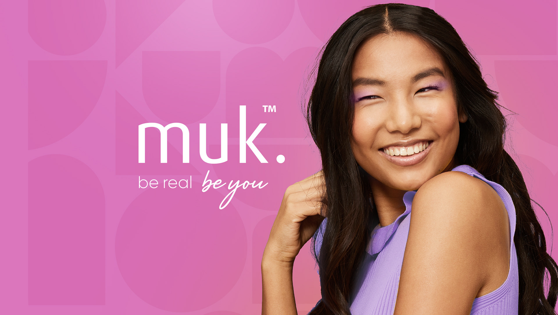
muk’s brand, positioning and photography had all become dated and the brand had stalled. The founders wanted to revitalise and grow the brand with a younger audience so we took it in a more colourful, authentic and inclusive direction with a new tagline “be real, be you”.
We developed graphic shapes taken from the negative space of the muk logo and updated the photography to be more spontaneous, playful and less staged than the previous style. The rebranding included everything from positioning, packaging, brochures, advertising to socials.