SHOPPER
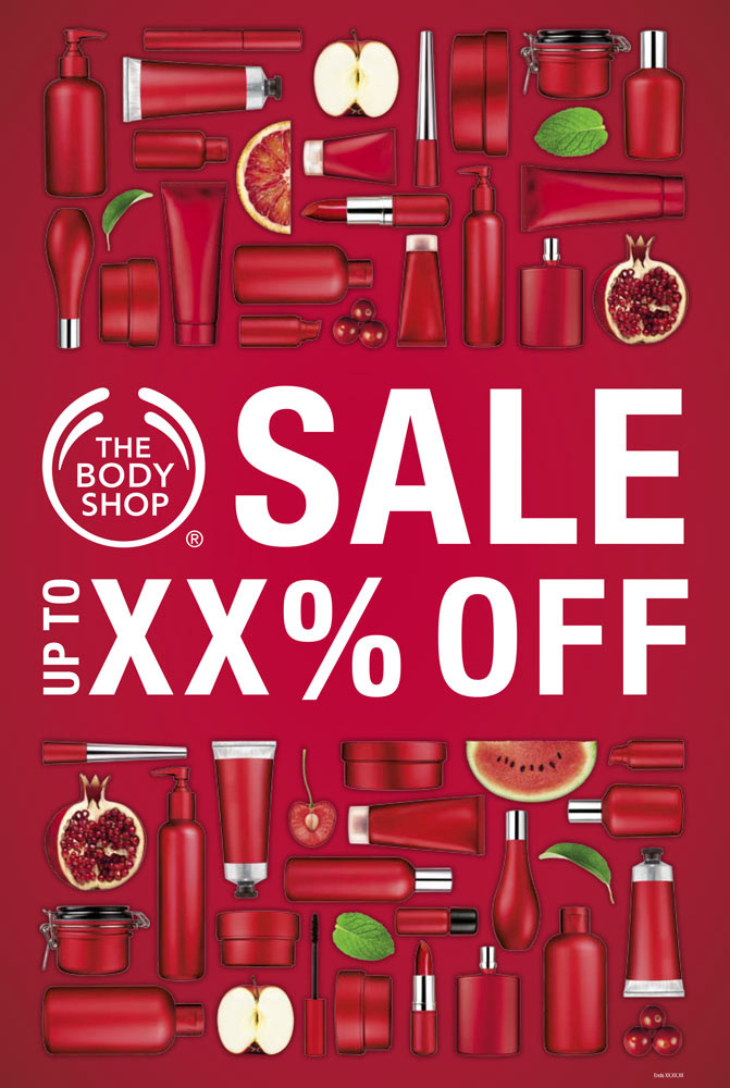
Red = sale time at The Body Shop. I made the most of it in this design to highlight abundance and sales in a premium way.The idea was to visualise the multitude of products in the sale using the brand’s generic packaging, highlighting their natural ingredients and sale time! The green 'fruit sticker' is a nod to fresh produce and an eye-catching changeable roundel.
On this project I worked with a senior art director and copywriter, briefed retouchers, digital designers and artworkers, managing design from concept to finish.
On this project I worked with a senior art director and copywriter, briefed retouchers, digital designers and artworkers, managing design from concept to finish.